Bigelow Tea – Brand Refresh
This rebranding initiative for Bigelow Tea was designed to elevate brand consistency, strengthen visual recognition, and connect more deeply with a new generation of tea drinkers—specifically millennial women who value health, wellness, and authenticity.
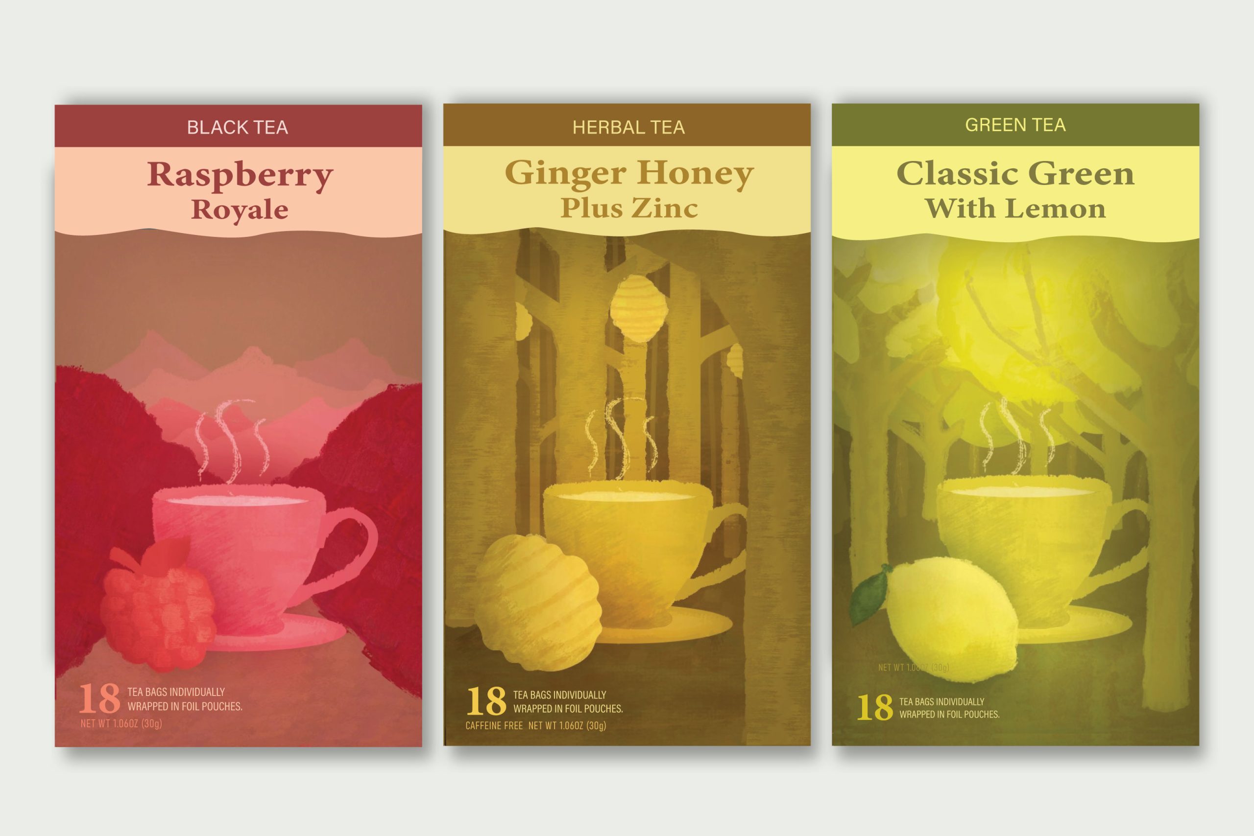
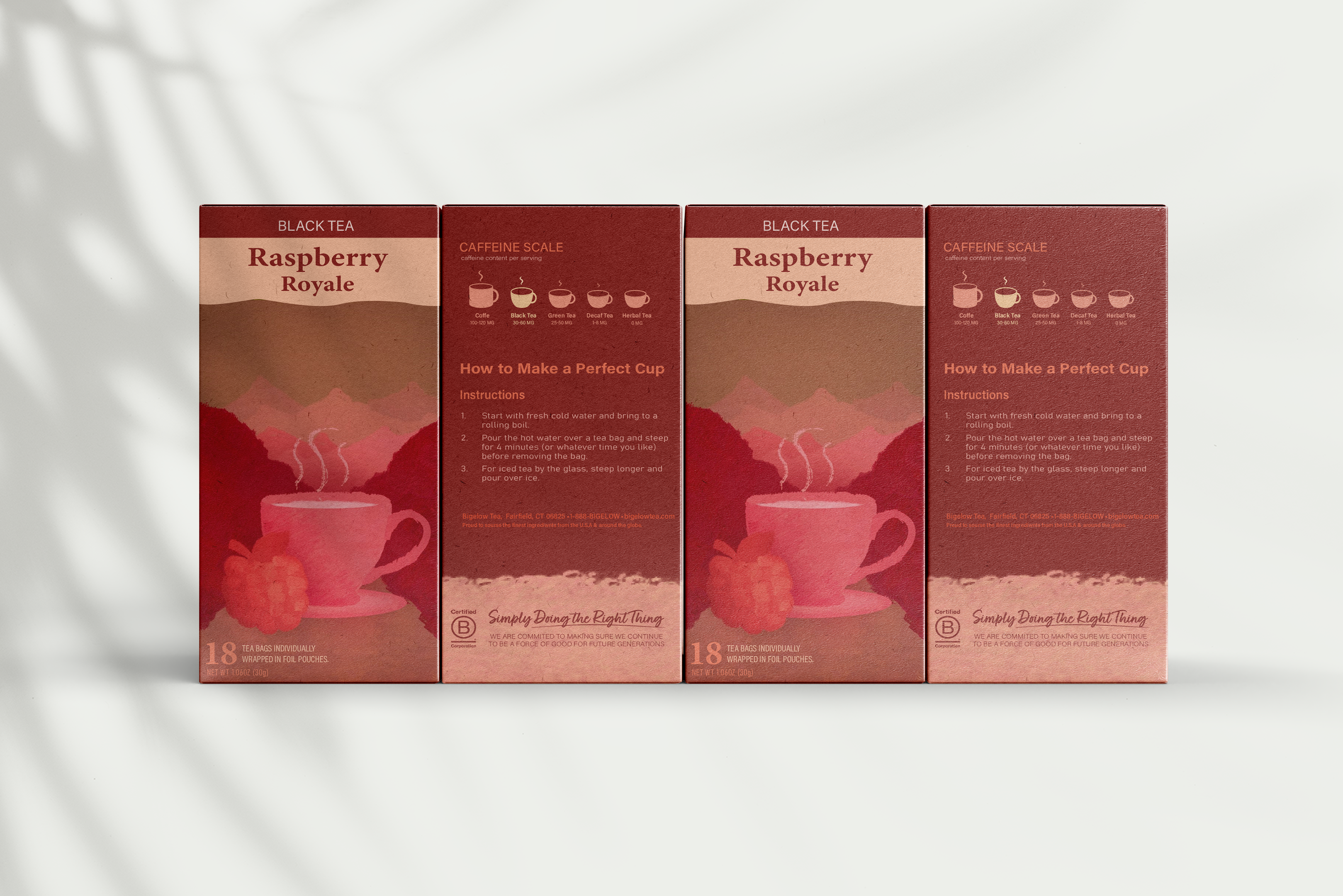
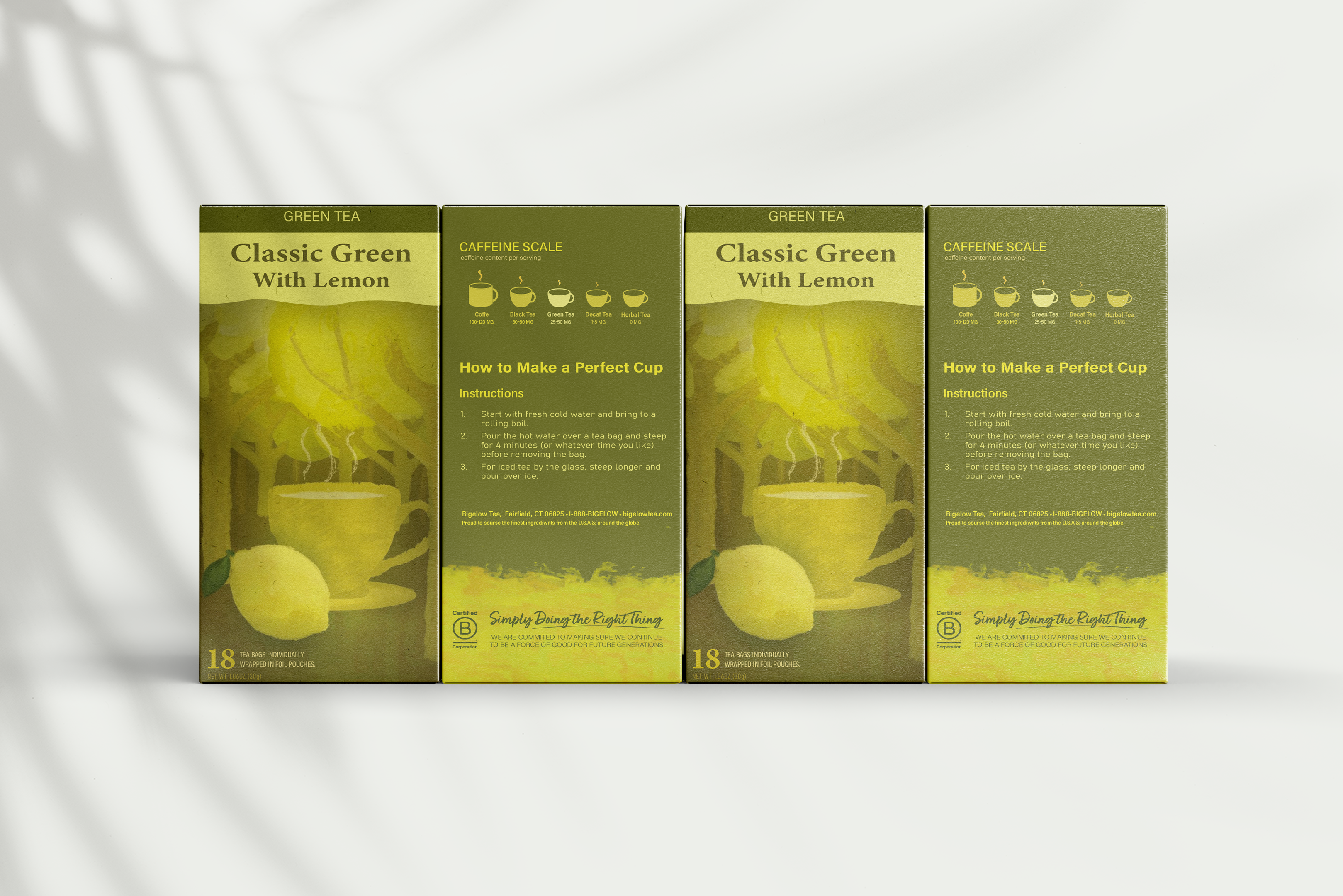
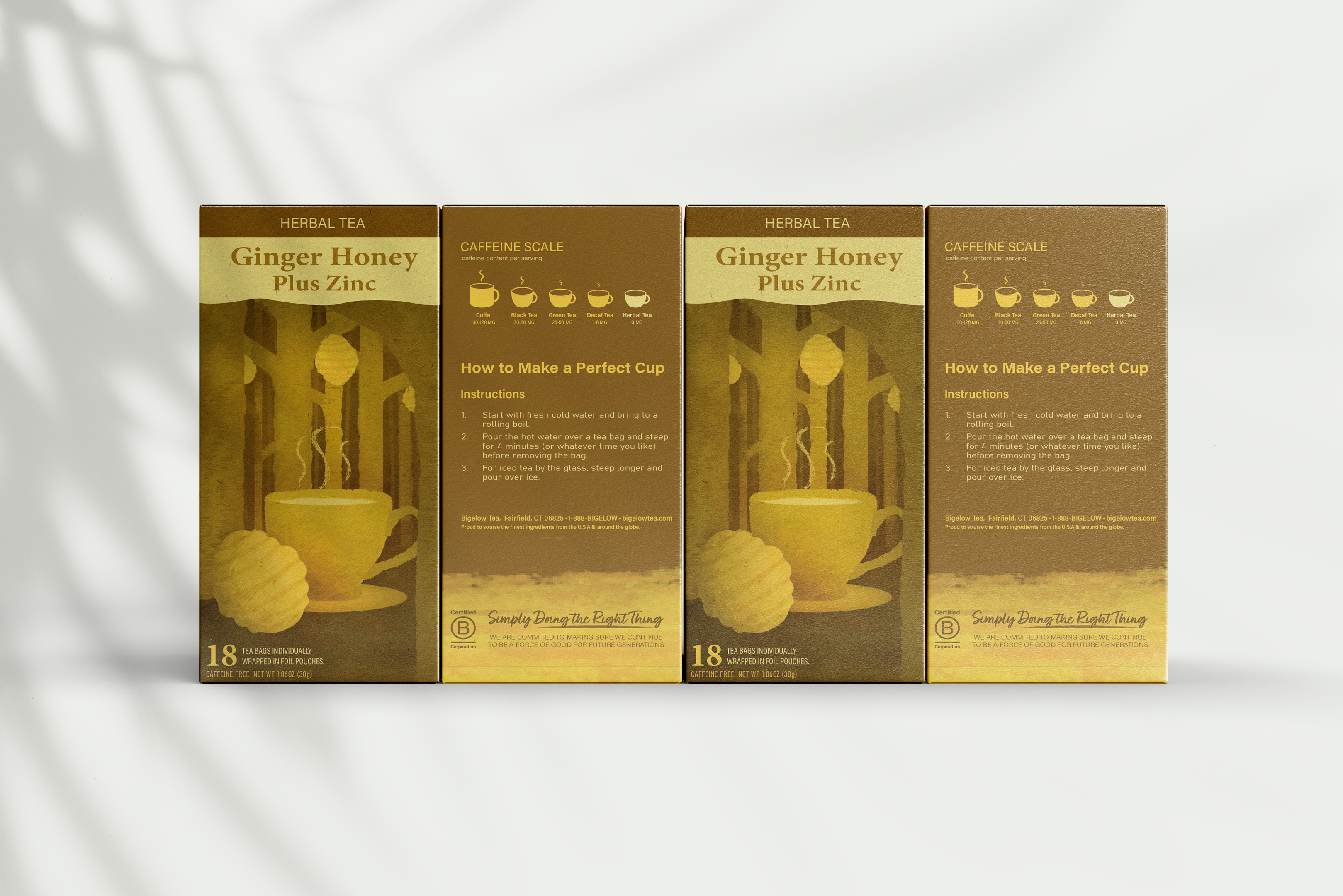
The refreshed identity introduces a painterly visual style inspired by acrylic textures, offering a unique and organic look that stands out in a saturated market. Each tea blend features a distinct monotone color palette tailored to its flavor profile, balancing simplicity with bold composition and drawing attention on store shelves. This visual direction enhances emotional resonance and modern appeal, aligning with the aesthetic expectations of the target demographic.
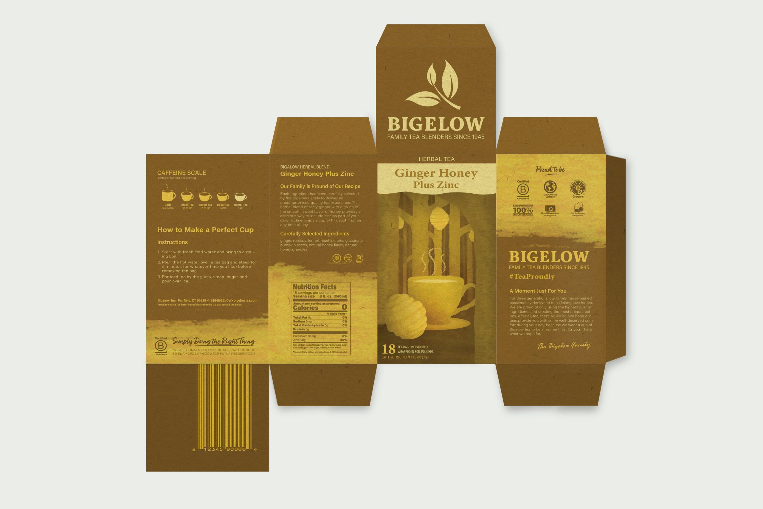
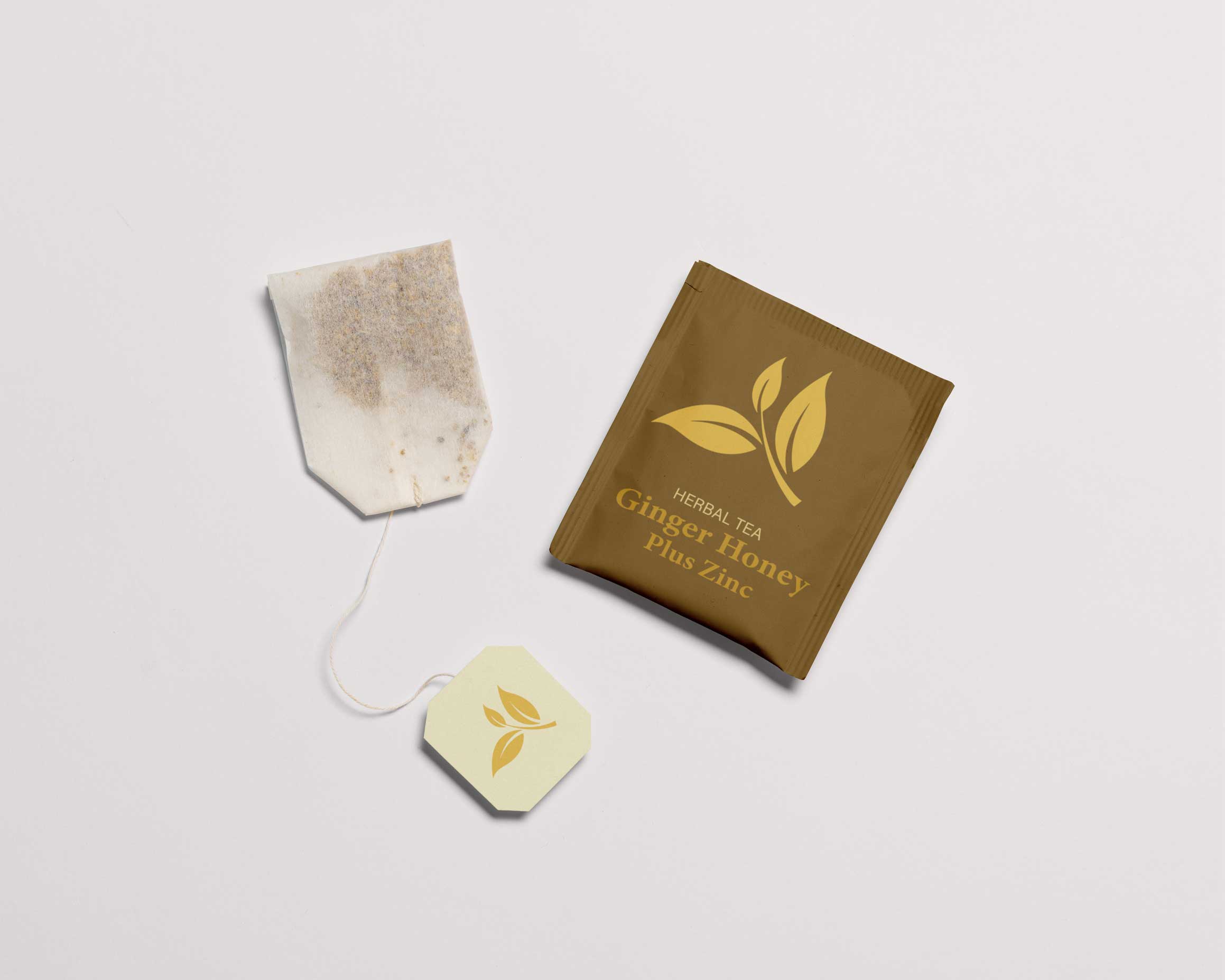
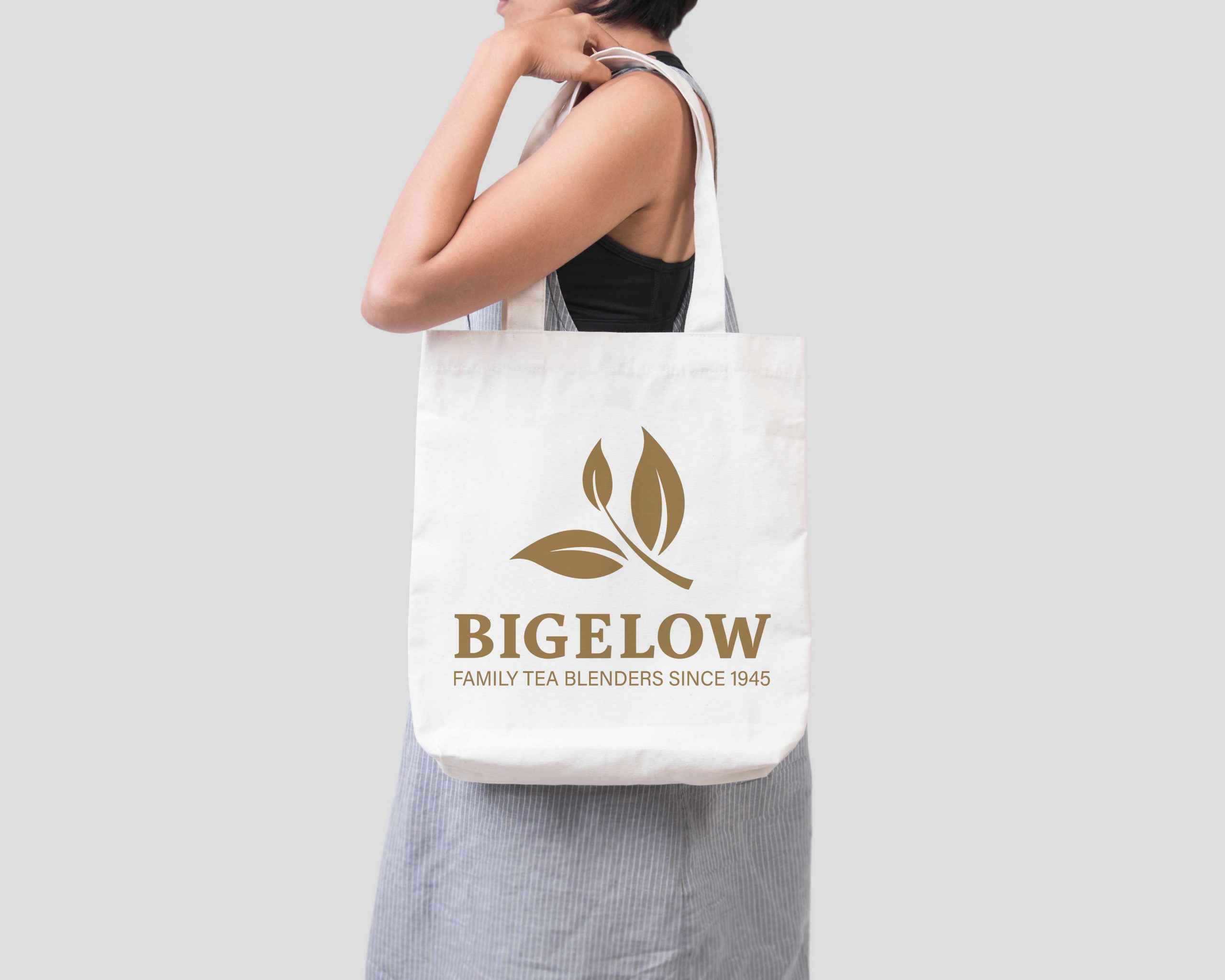
Deliverables included a revised logo that honors Bigelow’s heritage while embracing a cleaner, more contemporary look, a flexible packaging template, and three unique tea box designs that blend storytelling with function. The brand strategy was reimagined to emphasize values of quality, flavor, and wellness, creating a cohesive identity that speaks to modern sensibilities while maintaining Bigelow’s trusted legacy.
This rebrand positions Bigelow Tea for continued relevance and growth, appealing to a health-conscious, design-savvy audience through meaningful visuals and intentional storytelling.
